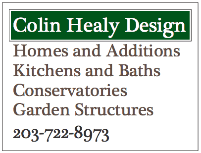
For years I used a construction site sign that described the kinds of projects that I liked to design. Every word was true, but I was often mistaken as a builder and it limited the types of projects I got. It did not address my purpose as a designer. The traditional serif typeface suggested that I specialized in traditional projects.
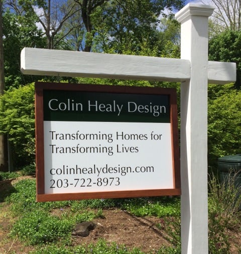
So I decided to make my job sign about WHY I design instead. My mission is to help people transform their homes to fit their changing lives. I design for the lives people want to create for themselves and their families. I transform homes to fit the people my clients want to become. The san-serif typeface is formal but not traditional and allows me to address a wider range of projects.
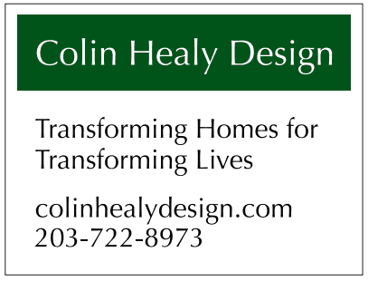
In the end, my new sign better expresses who I am and what motivates me without limiting me to specific project types. What do you think?